
Tong Wang’s Interpretation of Minimalism: Minimalist But Not Minimal
Tong Wang was approached to design a visual identity for Bad Monster, a distinctive Chinese skateboard brand with an eye-catching name and design. The brand's desire to launch a Chinese skateboard brand in a market dominated by brands from Canada, America, and Australia made the project intriguing for Wang.
Contributions
Organization
Bad Monster, a skateboard brand from China
Role
Visual Identity Design
Logo Design
Illustration/ Skateboard Art
Project Duration
October-December 2022
Design Tools
Photoshop, Illustrator
Overview
To create a visual identity that is eye-catching and distinctive, reflecting the brand's unique name and its Chinese origin.
Challenges
The skateboard market is dominated by brands from Canada, America, and Australia, making it difficult for a new Chinese brand to stand out. Additionally, the brand name and product seemed incongruent, making it challenging to find a design that would effectively communicate the brand's identity.
Goal
The goal of this project was to create a distinctive visual identity for Bad Monster, a skateboard brand from China, that would set it apart from other brands in the market dominated by Canadian, American, and Australian companies. The brand's name and product seemed incongruent, which made the challenge even more intriguing for the designer, Tong Wang. The objective was to design a logo that could effectively communicate the brand's identity, with a focus on highlighting the "monster" aspect of the name while maintaining a minimalist aesthetic. The client wanted an eye-catching design that would appeal to a young, trend-conscious audience while also conveying a sense of energy and dynamism that's inherent to skateboarding. The project's success was measured by the client's satisfaction with the final design and its ability to attract customers and generate brand recognition.


“I know I have to find a connection between the monster and the skateboard. I can’t just pick a monster face randomly and use that as the logo. Monster is a very attention-grabbing word so it’s necessary to highlight the monster itself in the design.”
— Tong Wang
Solutions
Visual artist Tong Wang was approached to design the brand's visual identity. Wang found his niche in minimalism, which he believed would be the perfect style to reflect the brand's unique identity. However, the biggest challenge was to create minimalist designs that are not too minimal.
After conducting a comprehensive examination, Wang noticed the prevalence of screws on skateboards. On average, there are four screws on each side of the board, with more screws being added for skateboards with more intricate designs. It was from this observation that Wang derived his original inspiration.
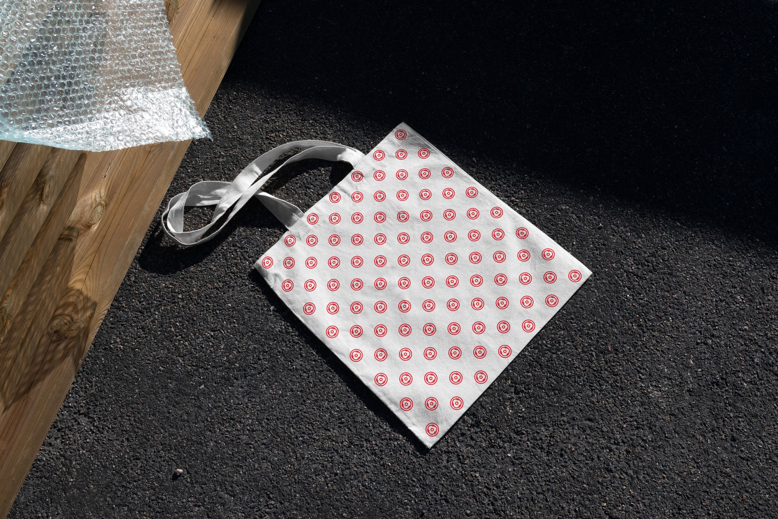
The arrangement of screws on the skateboard reminded Wang of human eyes, with the smaller screws being encircled by larger ones, resembling pupils. He leveraged this connection to create a monster’s eye design based on the shape and structure of the screws. Wang also incorporated elements of balance into the design, reflecting the importance of maintaining balance in skateboarding.
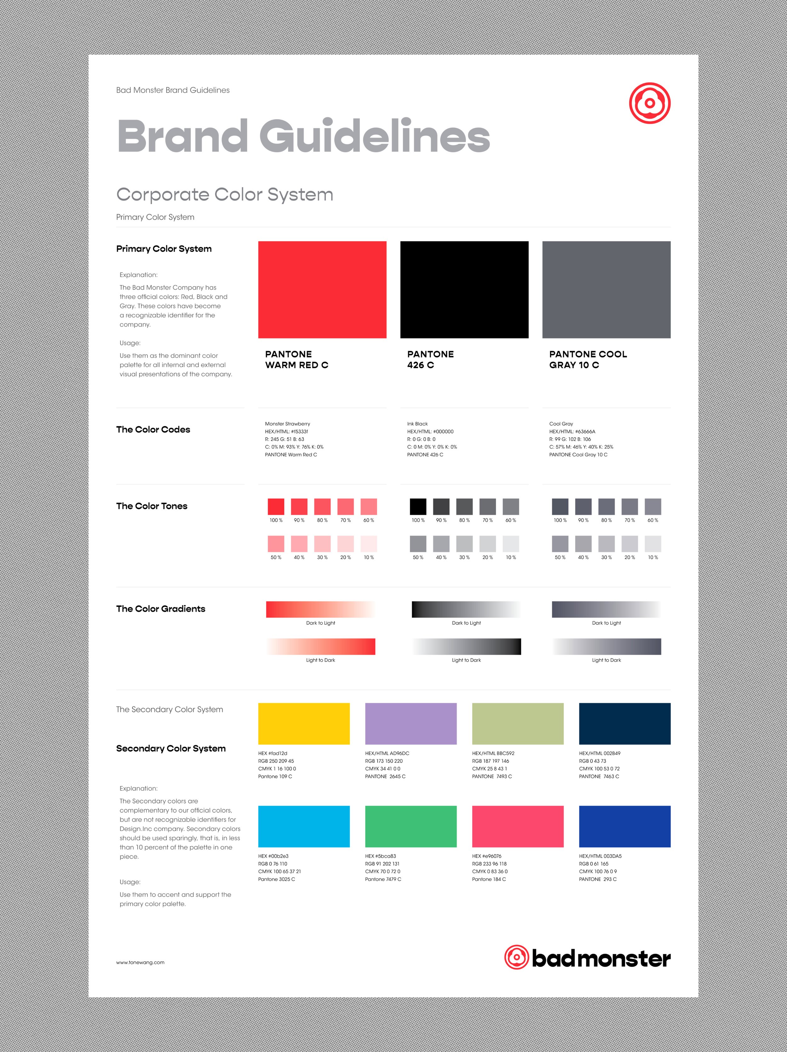
Wang then provided the brand with several different color combinations. Both sides eventually came to an agreement on black and red, which closely relate to the theme of the monster as well as the positivity and energy of skateboarding.


SPREADING THE WORD
SPREADING THE WORD
The final result was an eye-catching visual identity that effectively communicated the brand's unique identity. The monster's eye design based on the shape and structure of screws was not only creative but also reflected the brand's Chinese origin. The black and red color scheme also added to the brand's identity and effectively communicated the positivity and energy of skateboarding. Wang's minimalistic approach resulted in a unique and effective design that stood out in the crowded skateboarding market.
Outcome
Visual artist Tong Wang's exploration of minimalism proved to be an effective solution for the Bad Monster brand design. By leveraging the shape and structure of screws on skateboards, Wang created a unique design that effectively communicated the brand's identity. The final result was an eye-catching visual identity that effectively communicated the brand's unique identity and stood out in the crowded skateboarding market.
The final visual identity design for Bad Monster successfully reflects the brand's unique identity as a Chinese skateboard brand with an eye-catching and memorable design. By leveraging the observation of the prevalence of screws on skateboards, Tong Wang was able to create a minimalist and balanced monster's eye design that cleverly incorporates the theme of skateboarding. The color combination of black and red was carefully selected to closely relate to the theme of the monster and reflect the positivity and energy of skateboarding. The resulting design successfully differentiates Bad Monster from its competitors and generates an active and dynamic vibe for today’s young generation, motivating them to stay up-to-date with the latest trends.
THE END