EVERLASTING UNION
EVERLASTING UNION
Crafting a Timeless Wedding Logo for Yuki
Witness the design journey of a wedding logo for Yuki, a cherished friend of 18 years, as her Chinese last names are elegantly merged and the iconic Great Wall of Beijing inspires a visually captivating emblem of their enduring friendship and forthcoming union.
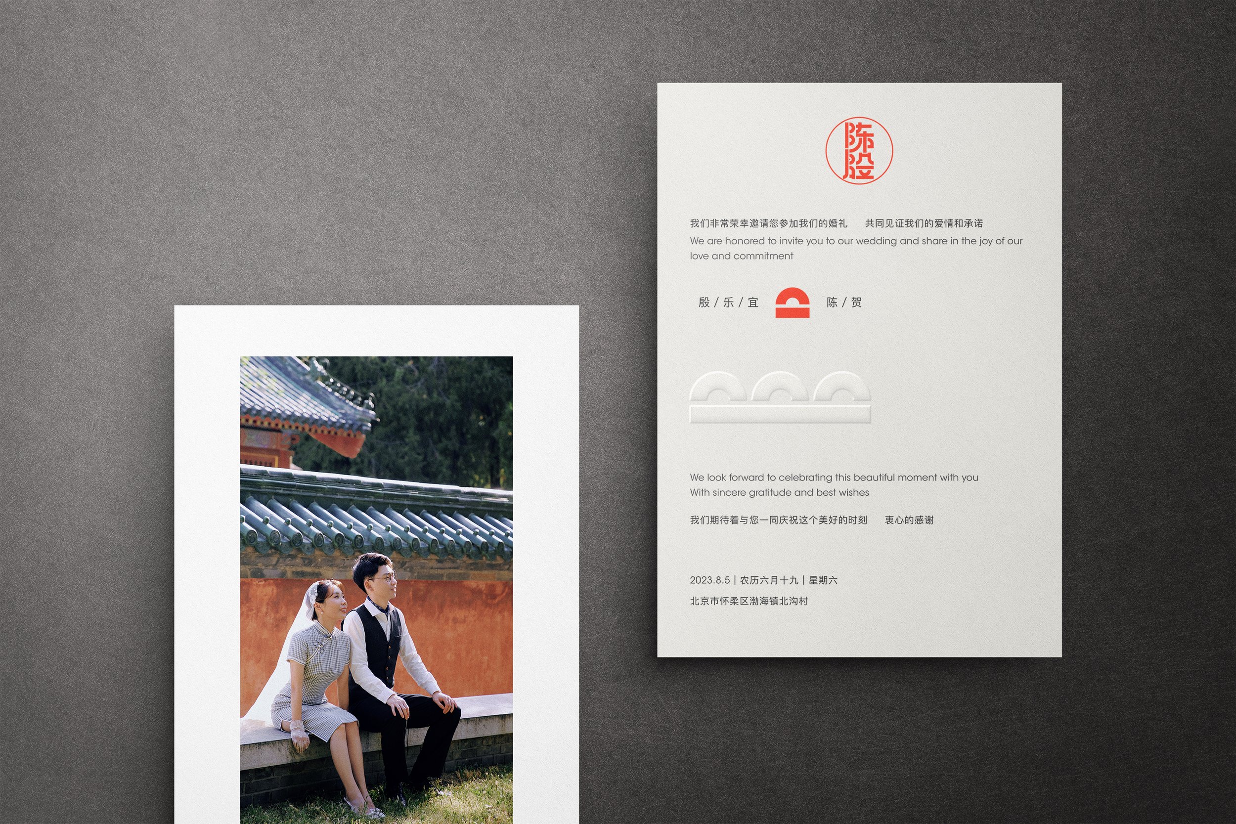
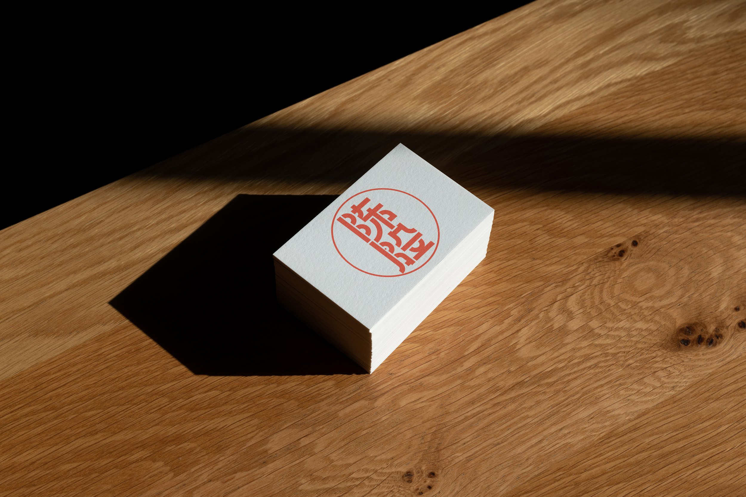
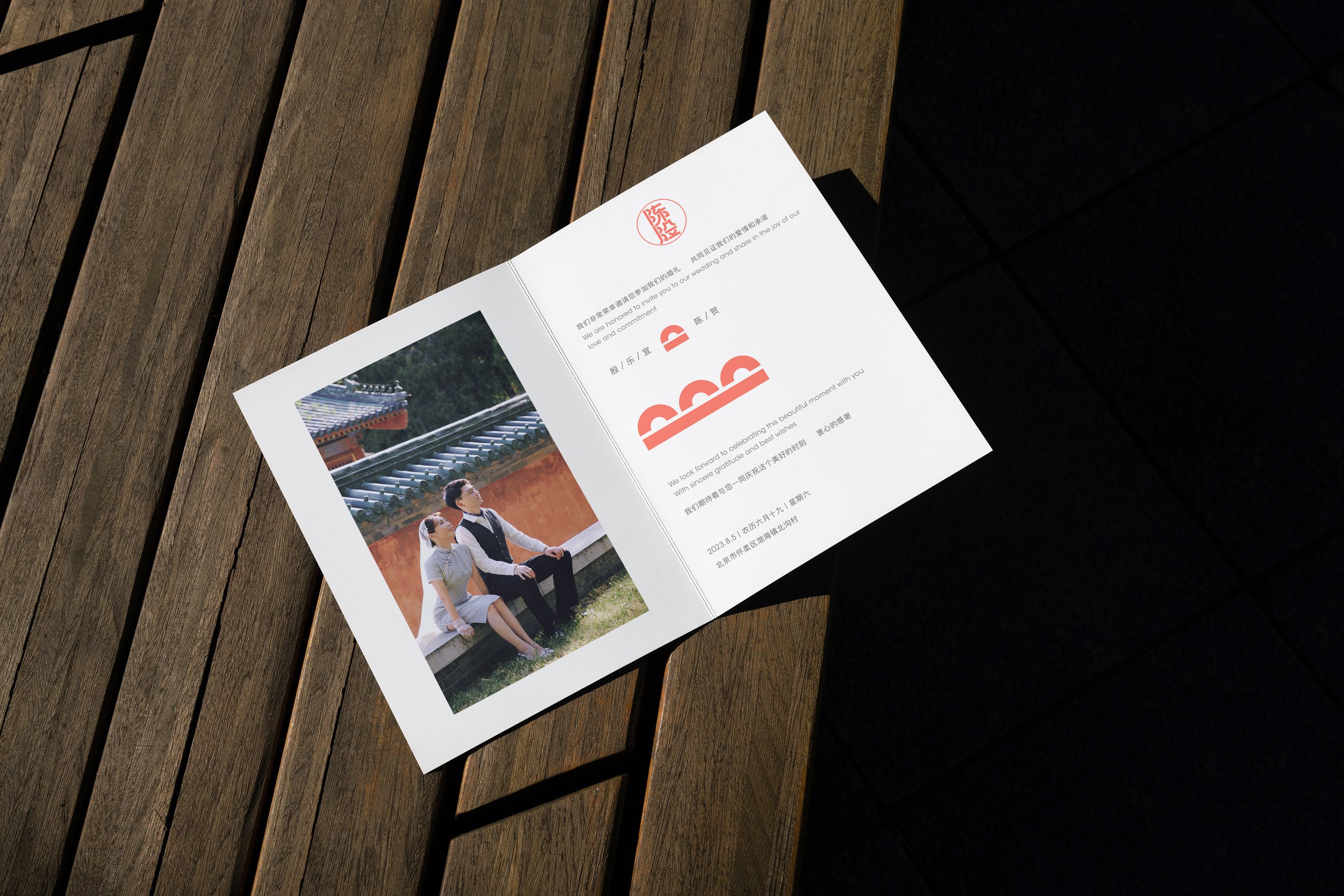
Eternal BondsThis case study explores the creative process of designing a wedding logo and brand identity for Yuki Yin 殷乐宜, a dear friend of 18 years, and her husband He Chen 陈贺. The objective was to blend their Chinese last names, 殷, and 陈, into a visually striking logo while incorporating elements inspired by the majestic Great Wall of Beijing, the location of their upcoming wedding. This case study delves into the thoughtful design decisions and artistic choices that resulted in a logo emblematic of their enduring friendship and eternal union.


Design Rationale
-
To begin, extensive research was conducted, examining Chinese calligraphy, geometric shapes, and architectural features of the Great Wall. This phase involved gathering references and exploring traditional and contemporary design elements.
-
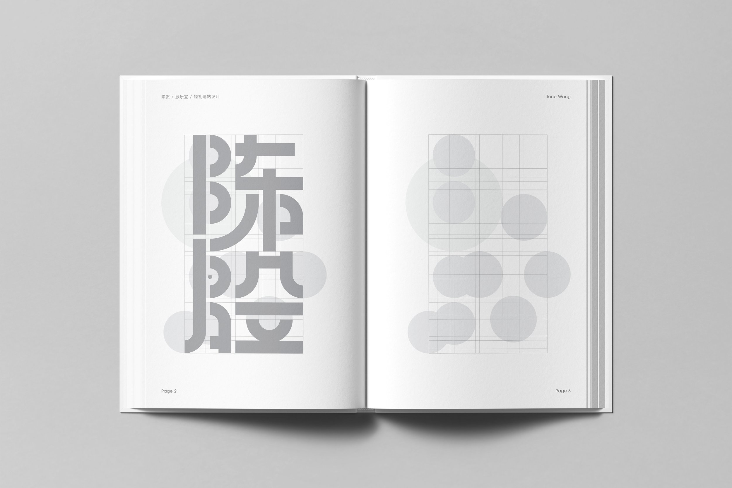
The creative process involved sketching numerous iterations to combine the last names 殷 and 陈 into cohesive shapes. Various geometric forms were explored to capture the essence of their names, while initial concepts were drafted to incorporate the grandeur of the Great Wall.
-
Incorporating Chinese calligraphy, distinct typefaces were crafted to represent the last names 殷 and 陈. These typographic elements aimed to reflect their cultural heritage and express elegance, with careful attention paid to strokes and balance.
-
Architectural elements such as the Great Wall silhouette, watchtowers, and intricate patterns were seamlessly integrated into the design. Balancing these elements with the typography, the logo began to take shape, embodying both the couple's shared heritage and their wedding's breathtaking location.
-
A color palette was meticulously chosen, considering traditional Chinese hues and wedding-associated tones. Colors were selected to evoke emotions of love, happiness, and warmth, while maintaining harmony and legibility within the logo design.
-
Promising sketches were digitized, refining the composition, proportions, and details using design software. Iterations were made, exploring different arrangements, sizes, and colors, ensuring a polished and visually appealing result.


“Architectural elements seamlessly merged with typography, shaping a logo that embodies the couple's heritage and the beauty of their wedding location.”
— Tong Wang