Crafting a Vision for Genuine Connection with Luna Landing Brand Design
Discover the refined brand identity for Luna Landing, crafted to embody sincerity, growth, and authenticity. My role as lead designer focused on a visual narrative that enhances genuine connections, supported by a modern and sophisticated design approach, including a distinctive logo and detailed brand guidelines.
Discover how we're fostering genuine connections at Lunar Landings.
Project Overview
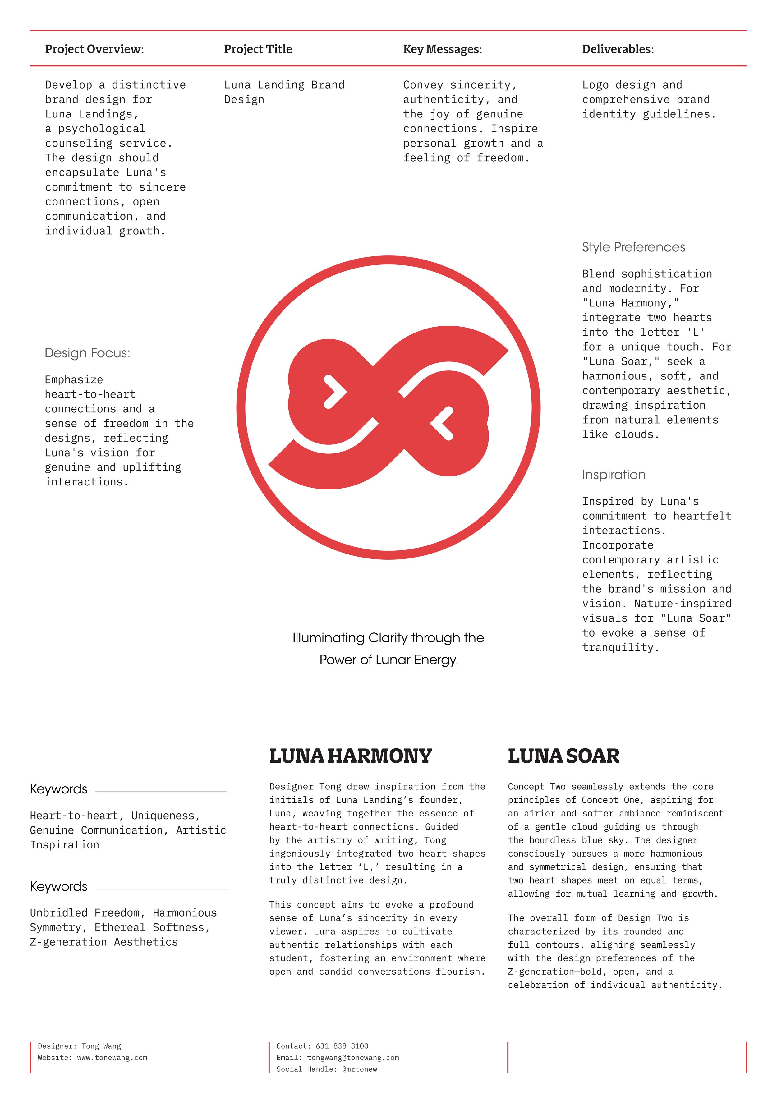
Luna Landings, a new psychological counseling service, is defined by its dedication to creating sincere connections and promoting individual growth through open communication. This project involves developing a unique brand identity that embodies these core values.


The Strategic Design Blueprint for Luna Landing
-
The core of the Luna Landing brand identity revolves around conveying sincerity, authenticity, and the joy of forming genuine connections. These themes are carefully intertwined with the promotion of personal growth and a sense of freedom, encapsulating the transformative journey Luna aims to facilitate for each client.
-
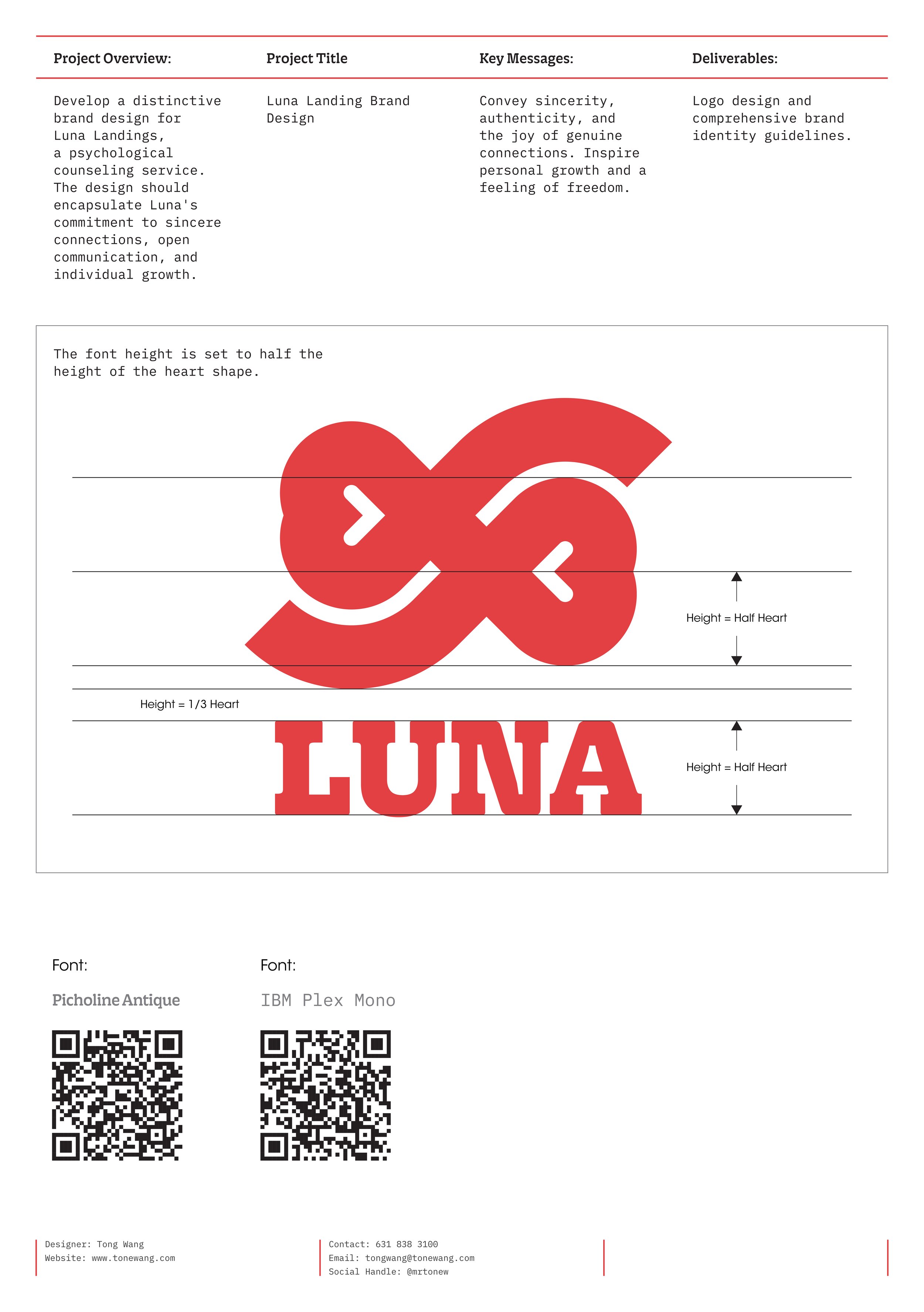
Logo Design: Develop a unique and meaningful logo that reflects the core values and mission of Luna Landings.
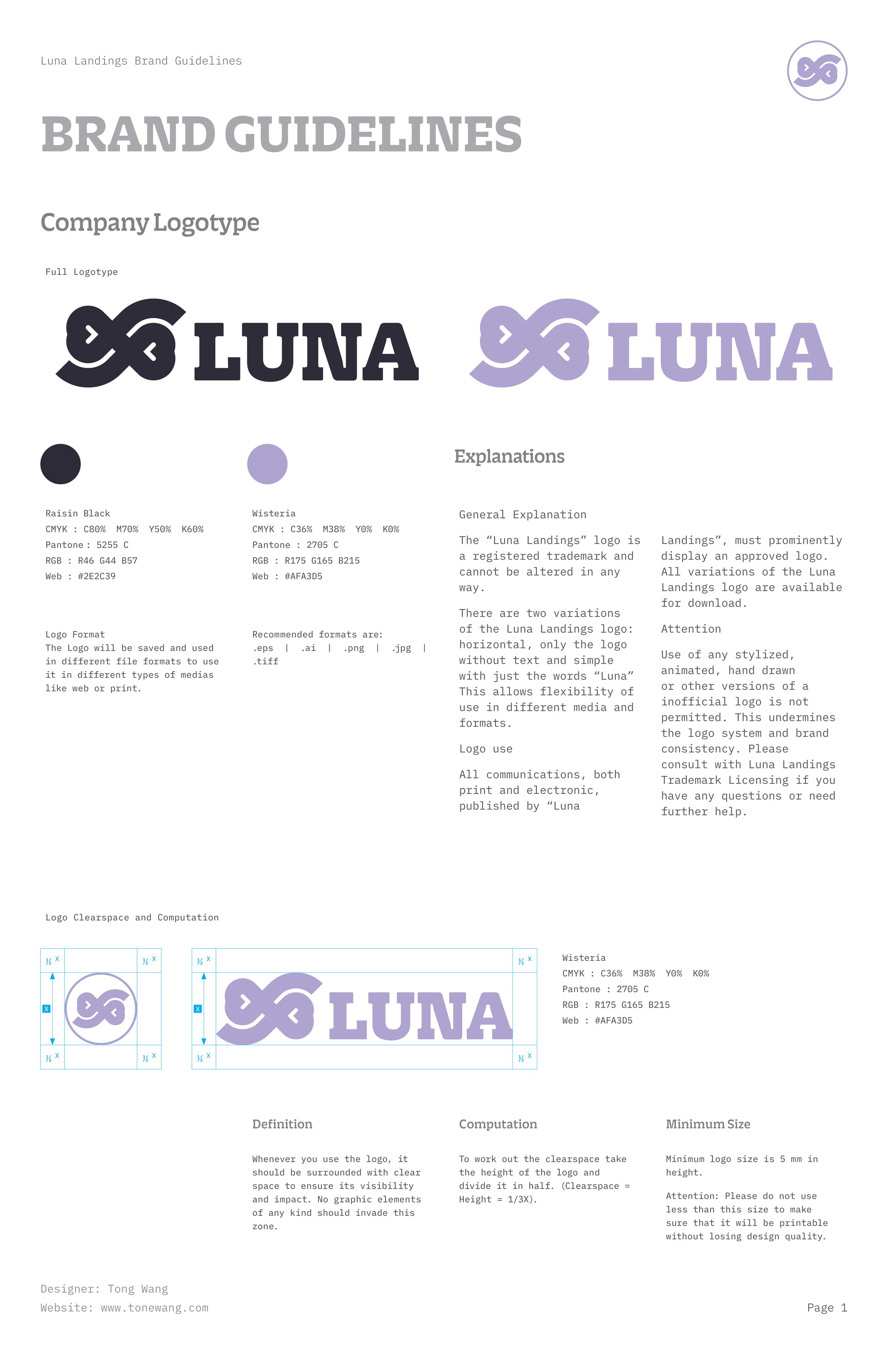
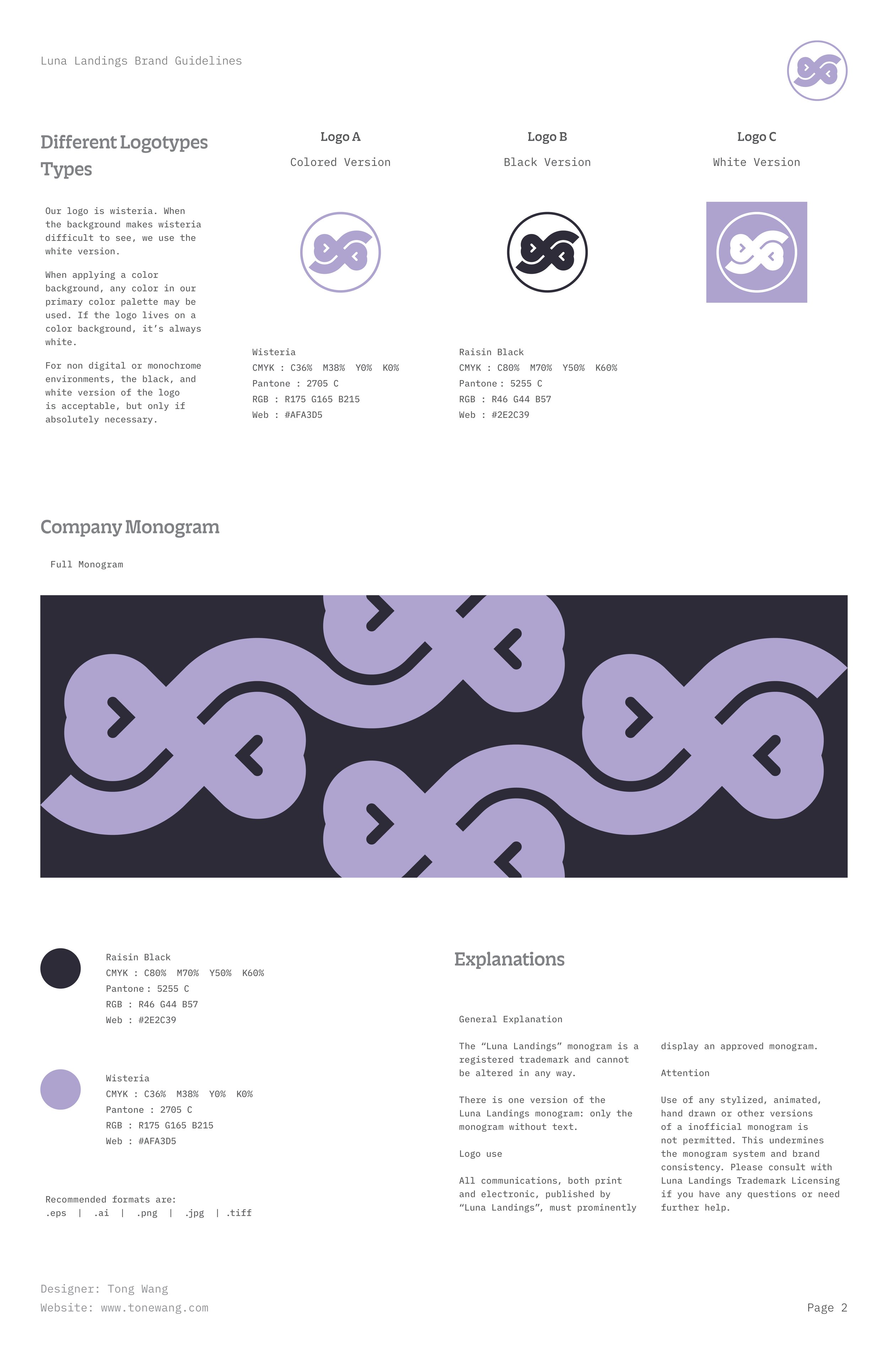
Brand Identity Guidelines: Create a comprehensive set of guidelines that define the visual and stylistic elements of the brand to ensure consistency across all forms of communication.
-
The design emphasizes creating visual representations of heart-to-heart connections, fostering a sense of liberation and openness that reflects Luna's commitment to authentic and uplifting interactions. The identity aims to visually manifest the essence of freedom and personal connection that Luna promotes.
“As a designer dedicated to meaningful interactions, each project I undertake is more than just aesthetics; it's about creating a visual language that speaks directly to the heart.”
— Tong Wang
Inspiration
The brand design is heavily inspired by Luna Landing’s commitment to heartfelt interactions. The approach combines contemporary artistic elements with nature-inspired visuals to evoke tranquility and openness. The integration of two hearts in the letter 'L' symbolizes Luna’s genuine approach to psychological wellness.
Two hearts in 'L' signify Luna's wellness focus.
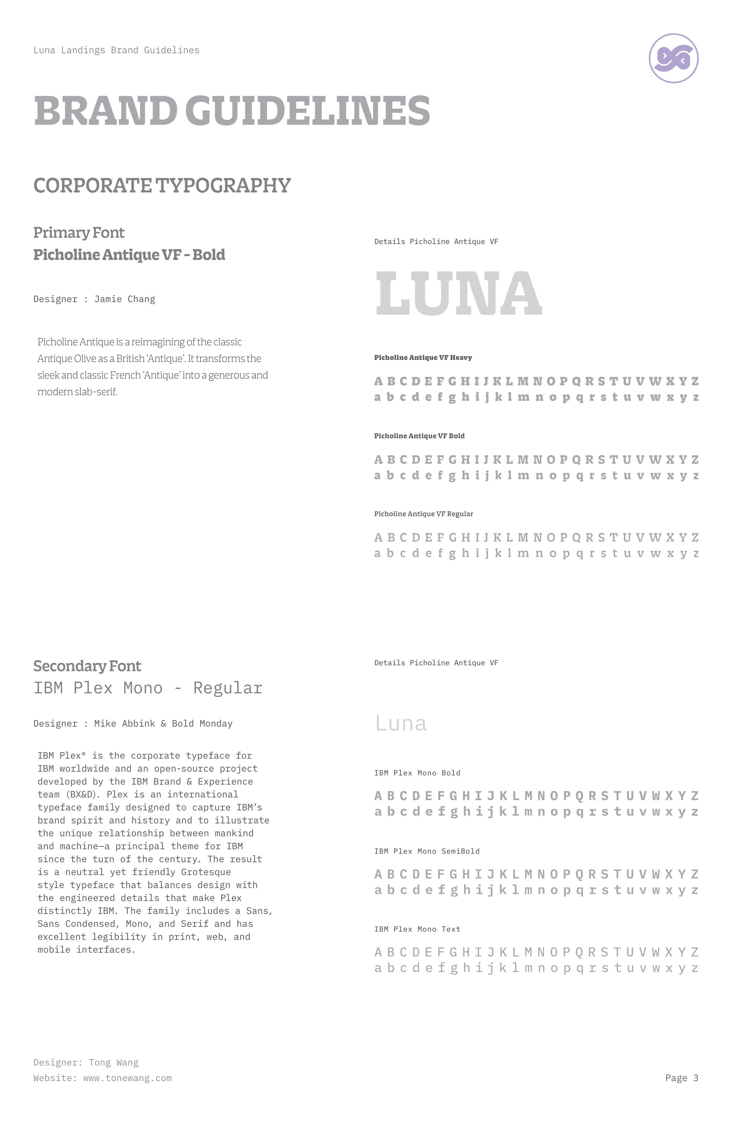
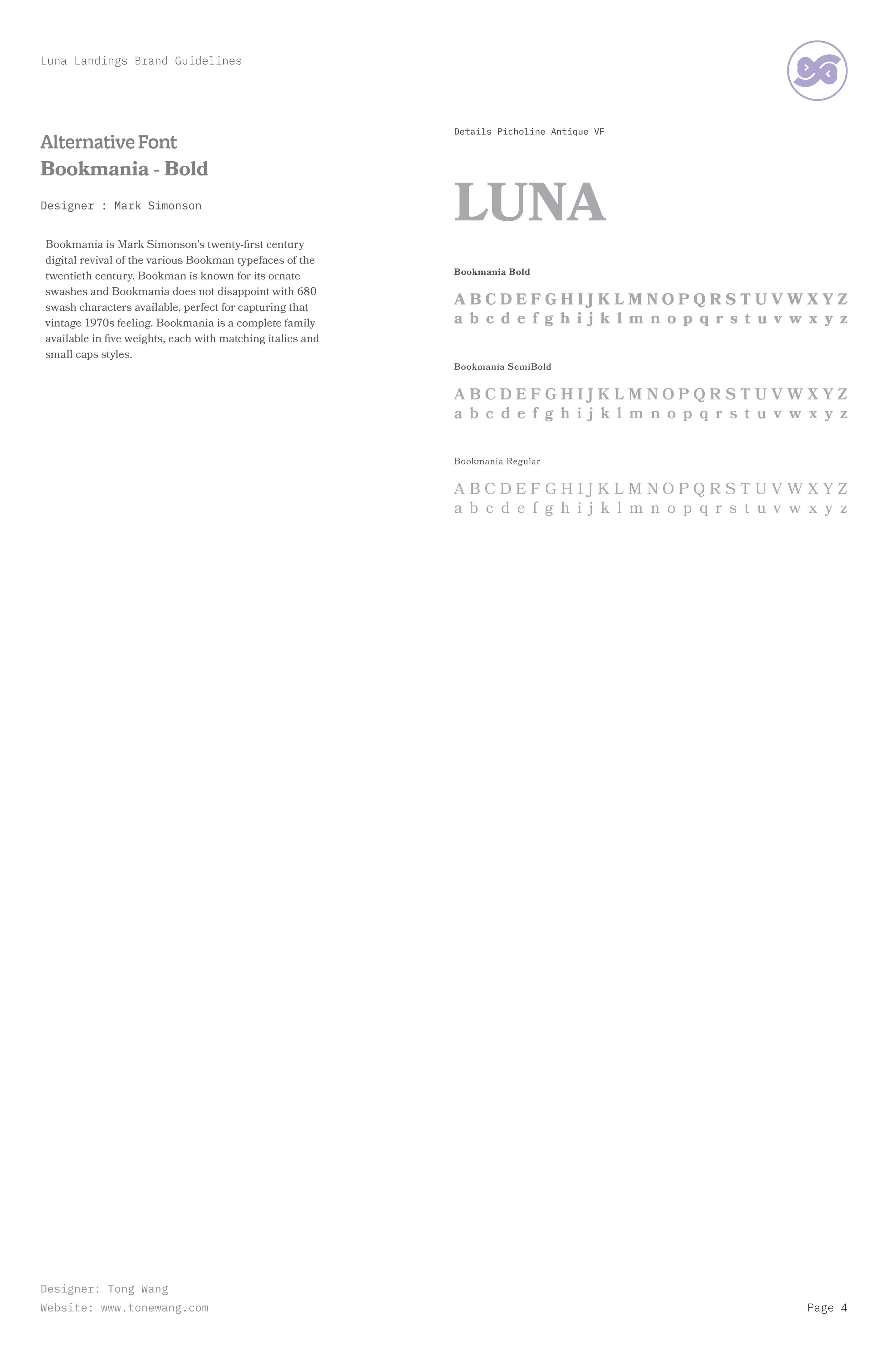
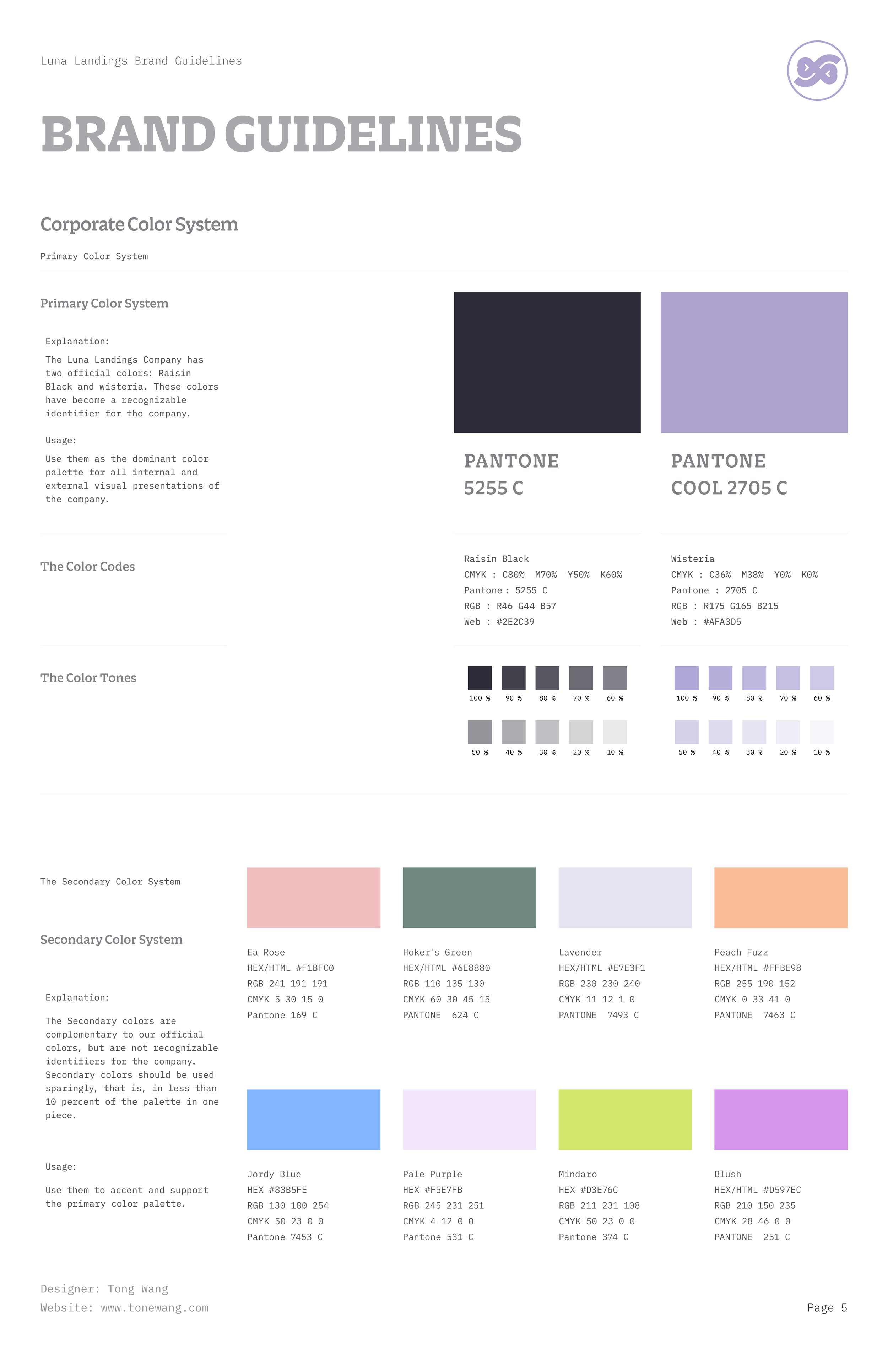
As the designer for Luna Landing, I wove Luna's essence into every brand element. Heartfelt symbols throughout the design embody the founder's vision for authentic relationships and growth. This project not only tested my skills but also enhanced my insight into visual communication for psychological health.
— Tong Wang


