
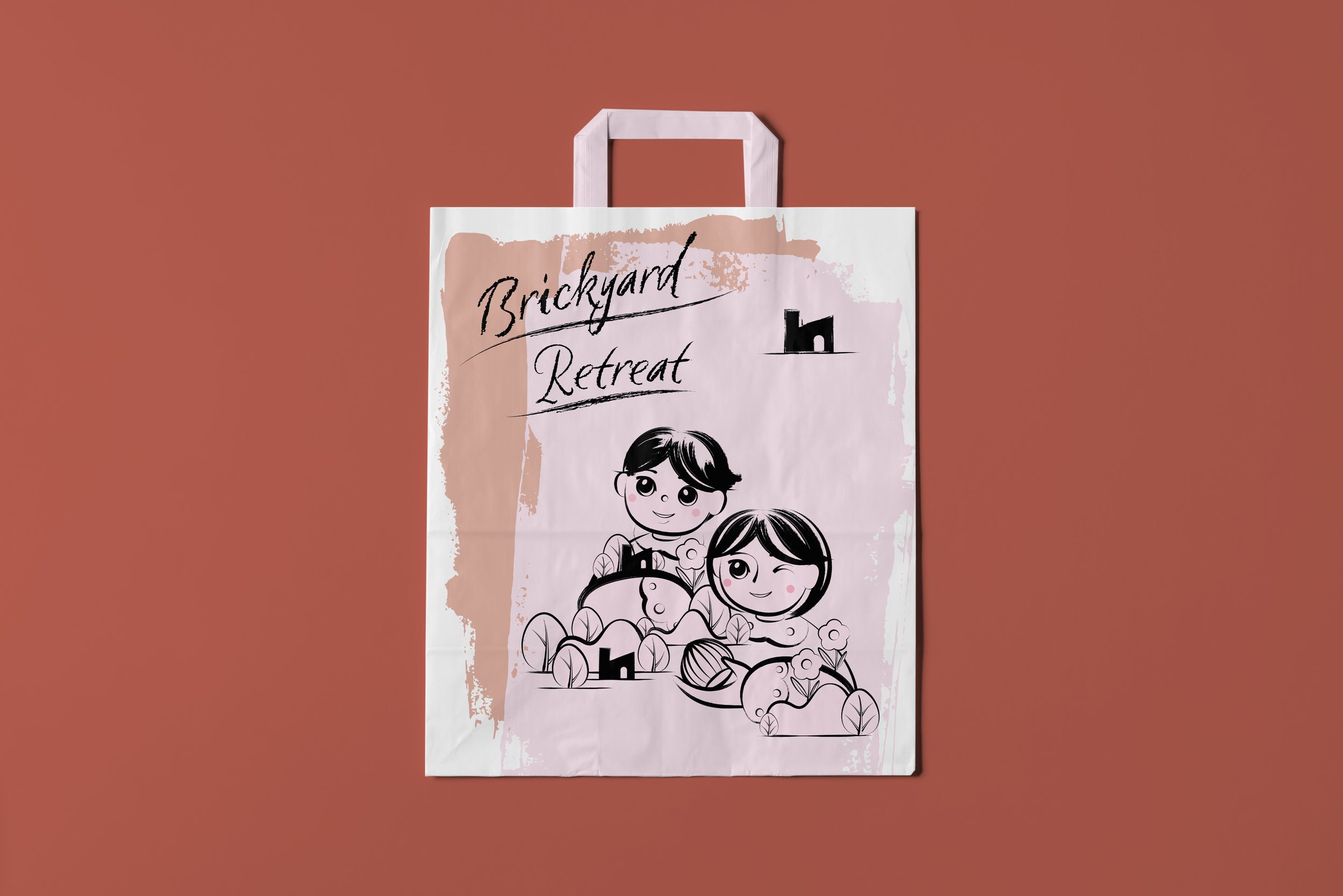
Chapter 01Elevating the Brickyard Retreat's Dessert Packaging
The Brickyard Retreat, a renowned countryside retreat celebrated for its natural beauty and historical significance, commissioned this packaging design project.
Client:
The Brickyard Retreat Hotel
Objective:
To redesign dessert packaging for a memorable guest experience and brand enhancement.
Designer's Approach:
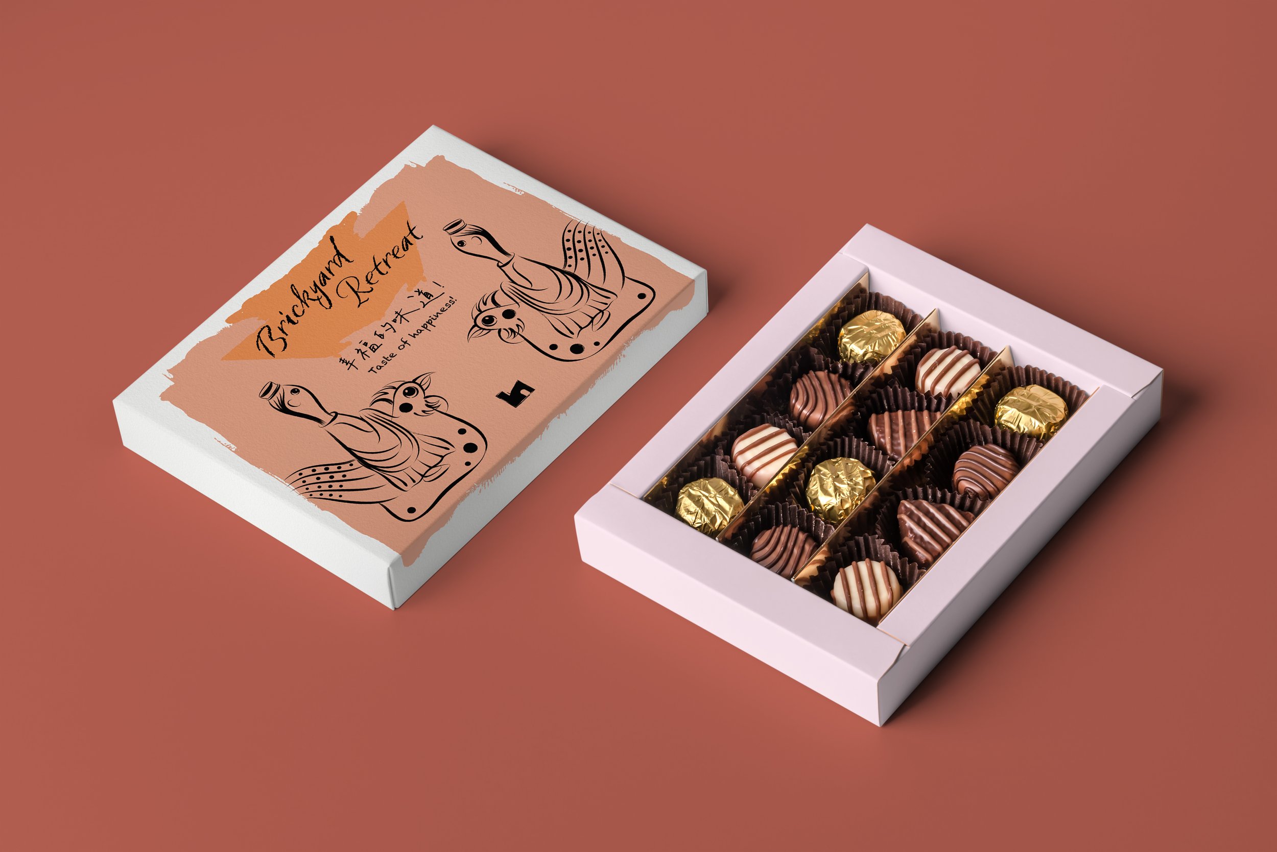
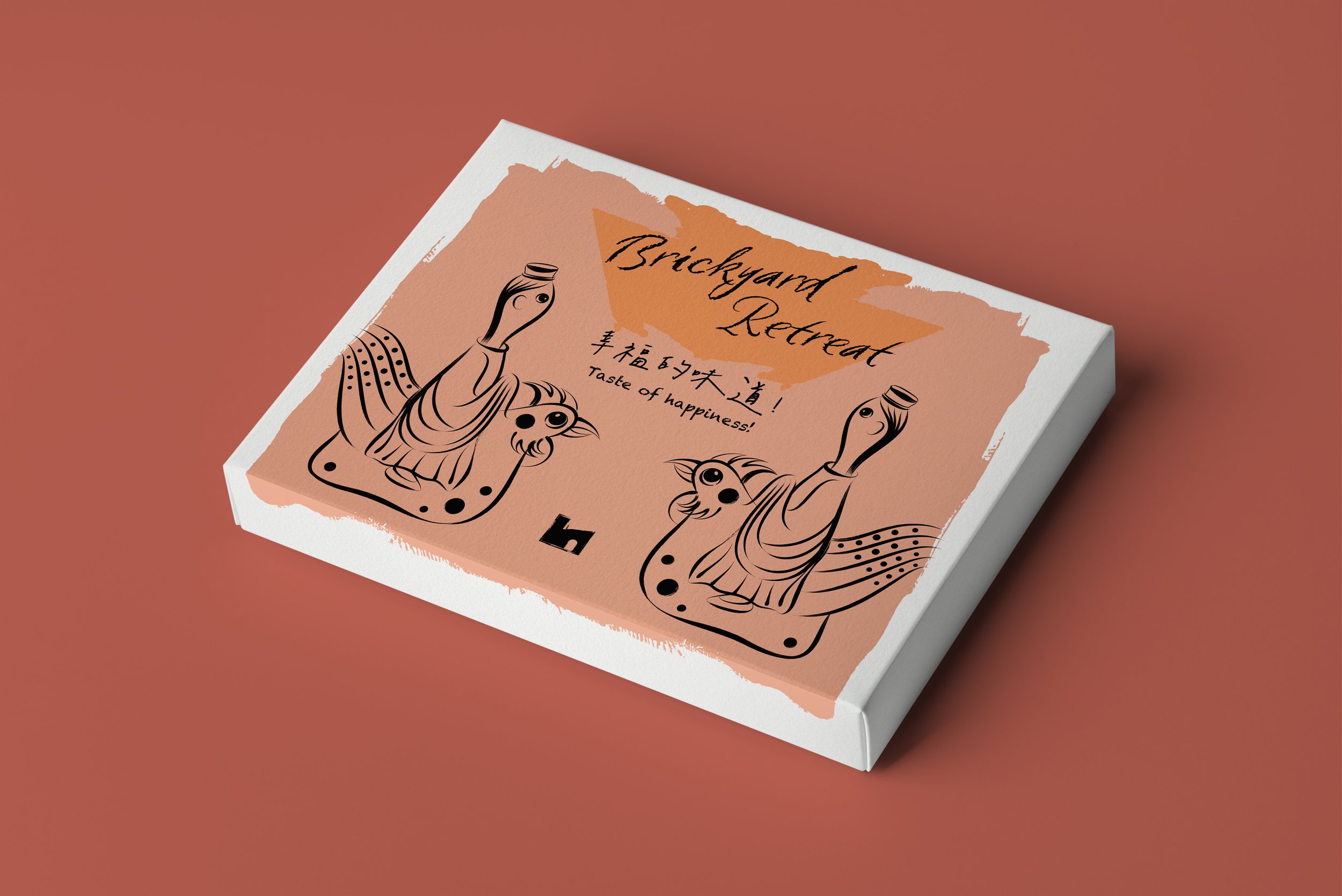
Color Palette: Earthy red, oak brown, and wheat-like tones were chosen, symbolizing the land's abundance, stability, and our connection with nature.
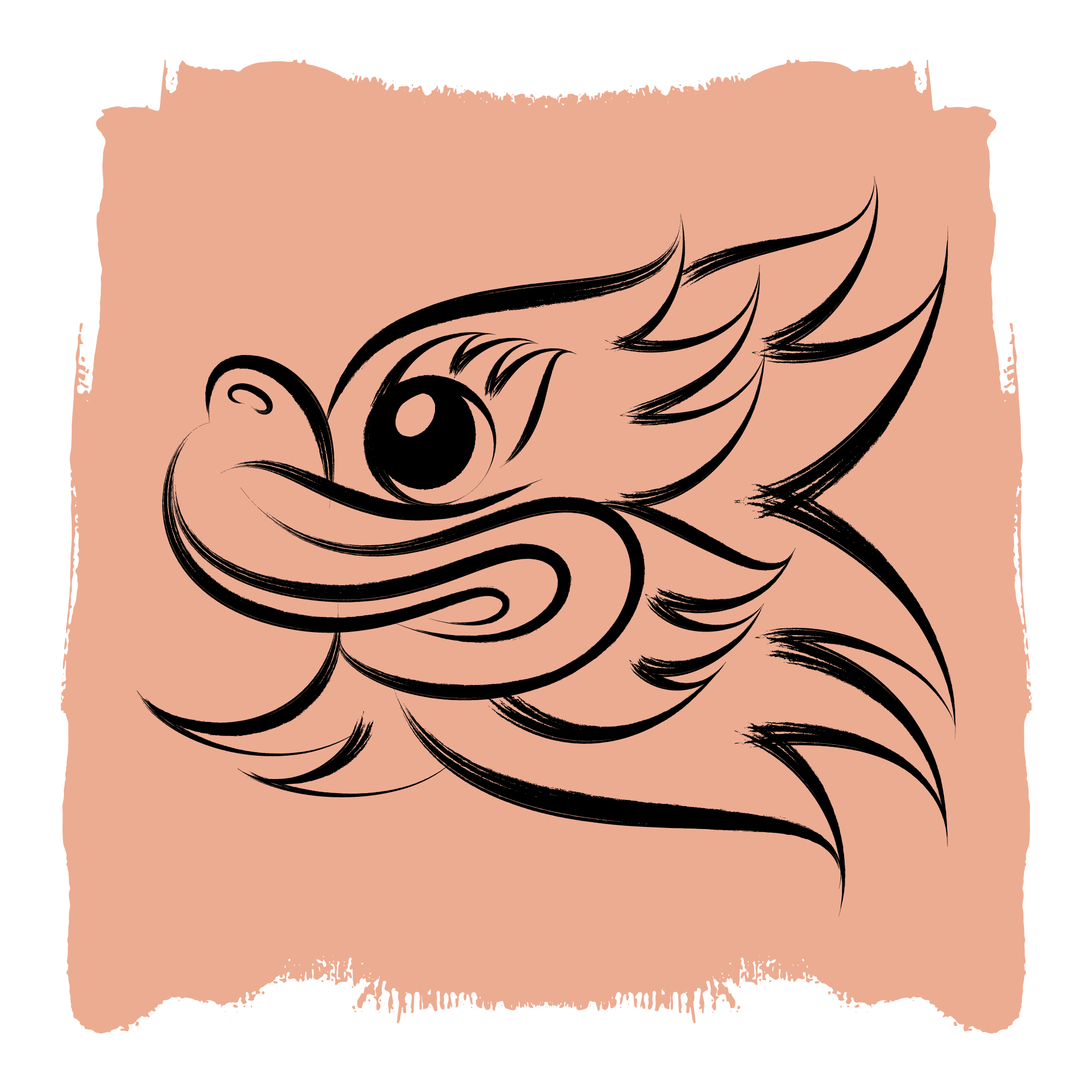
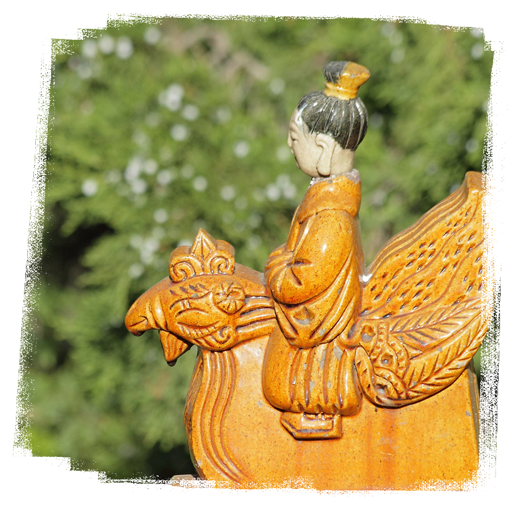
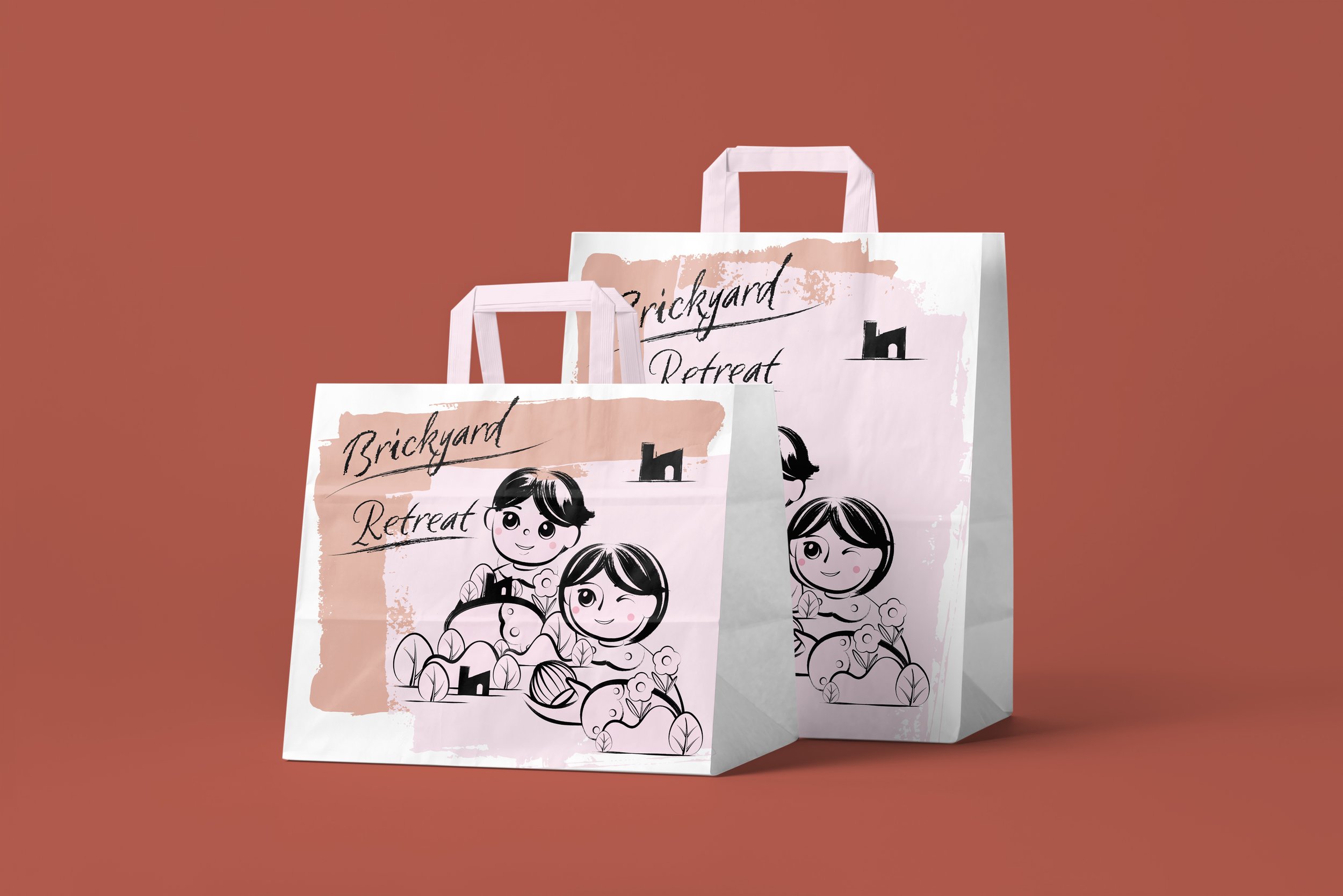
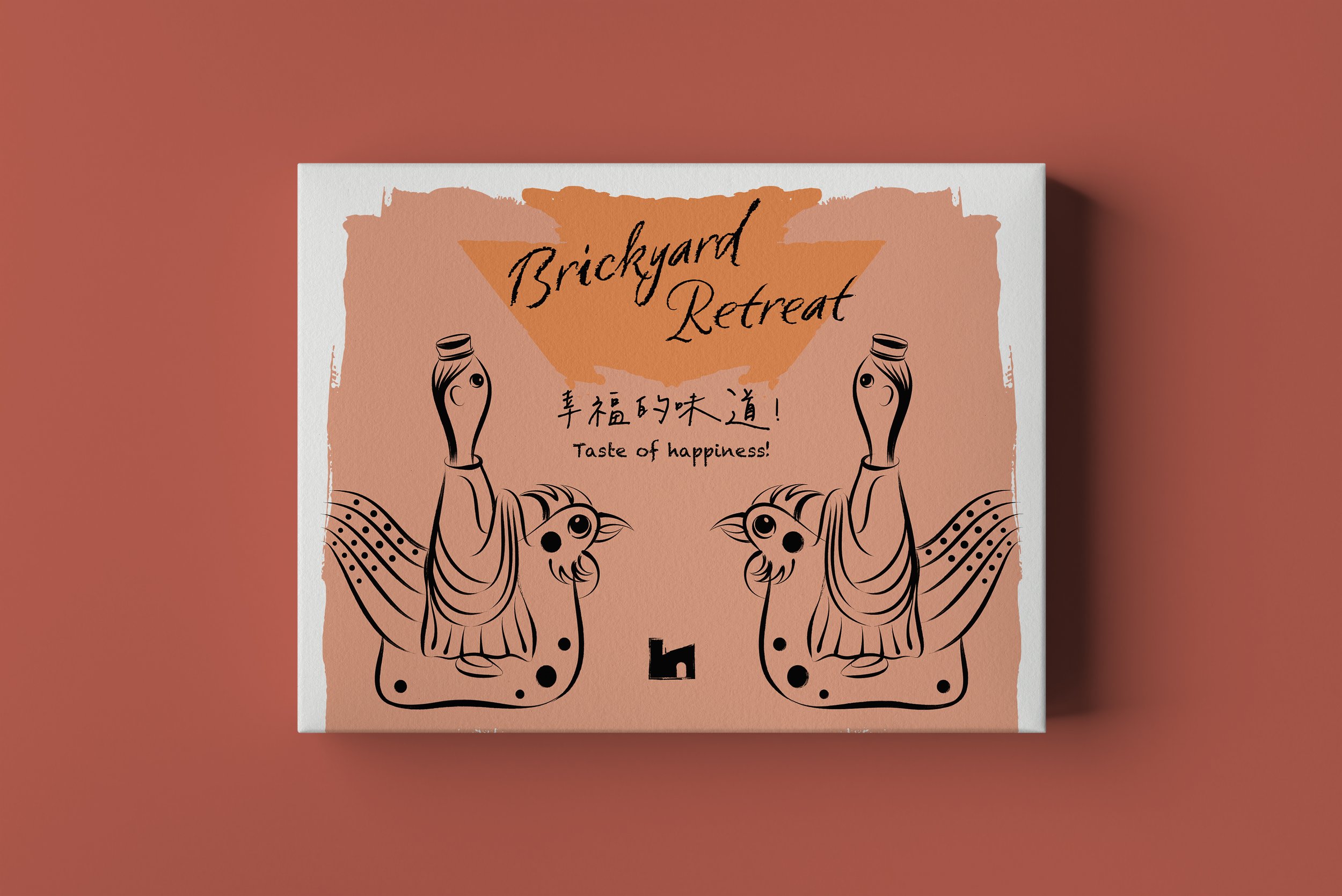
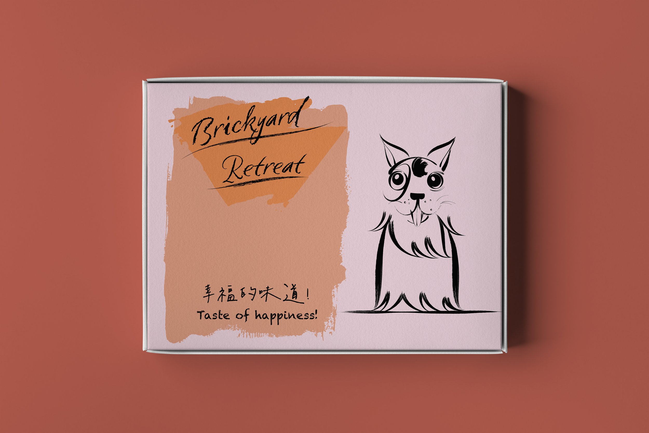
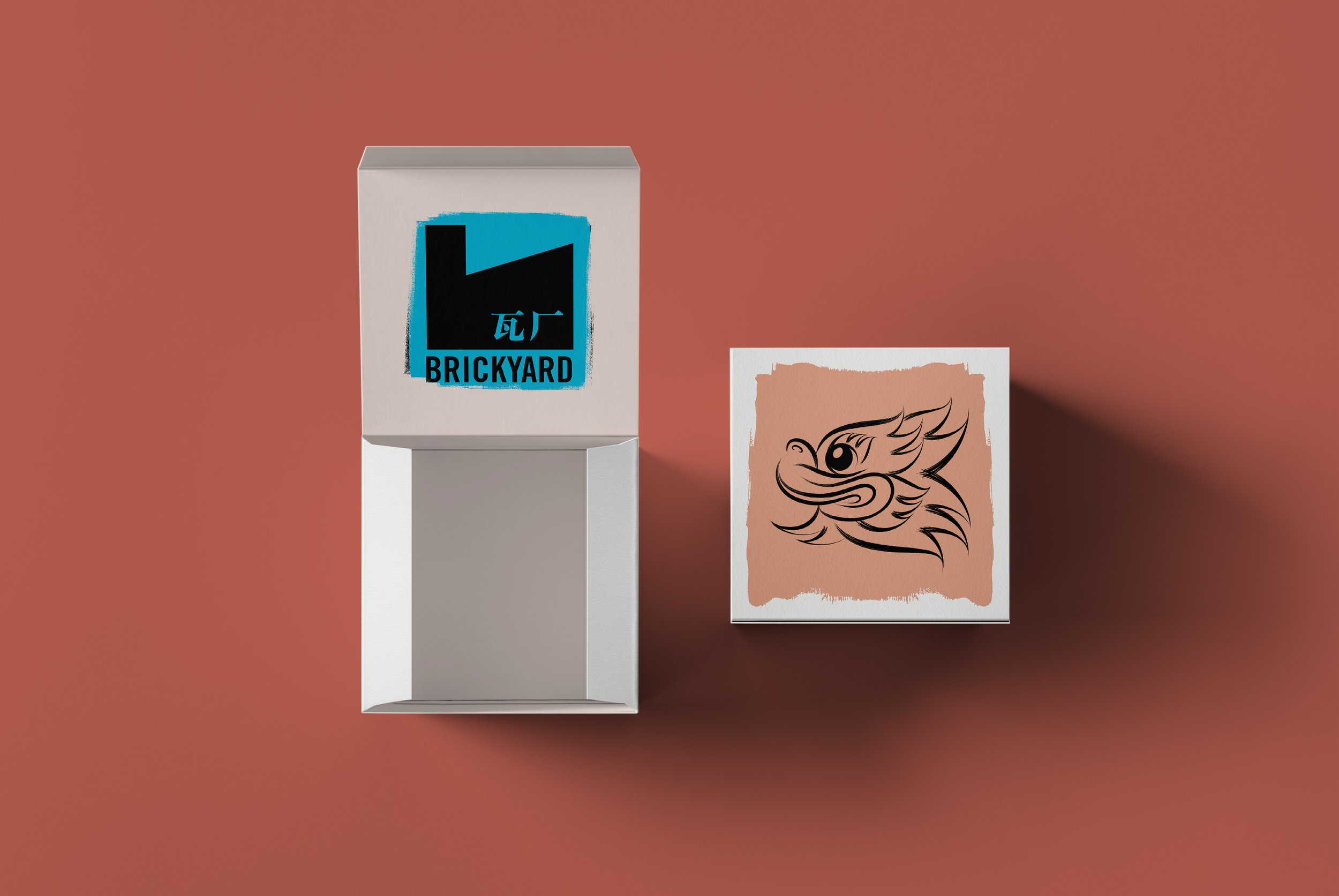
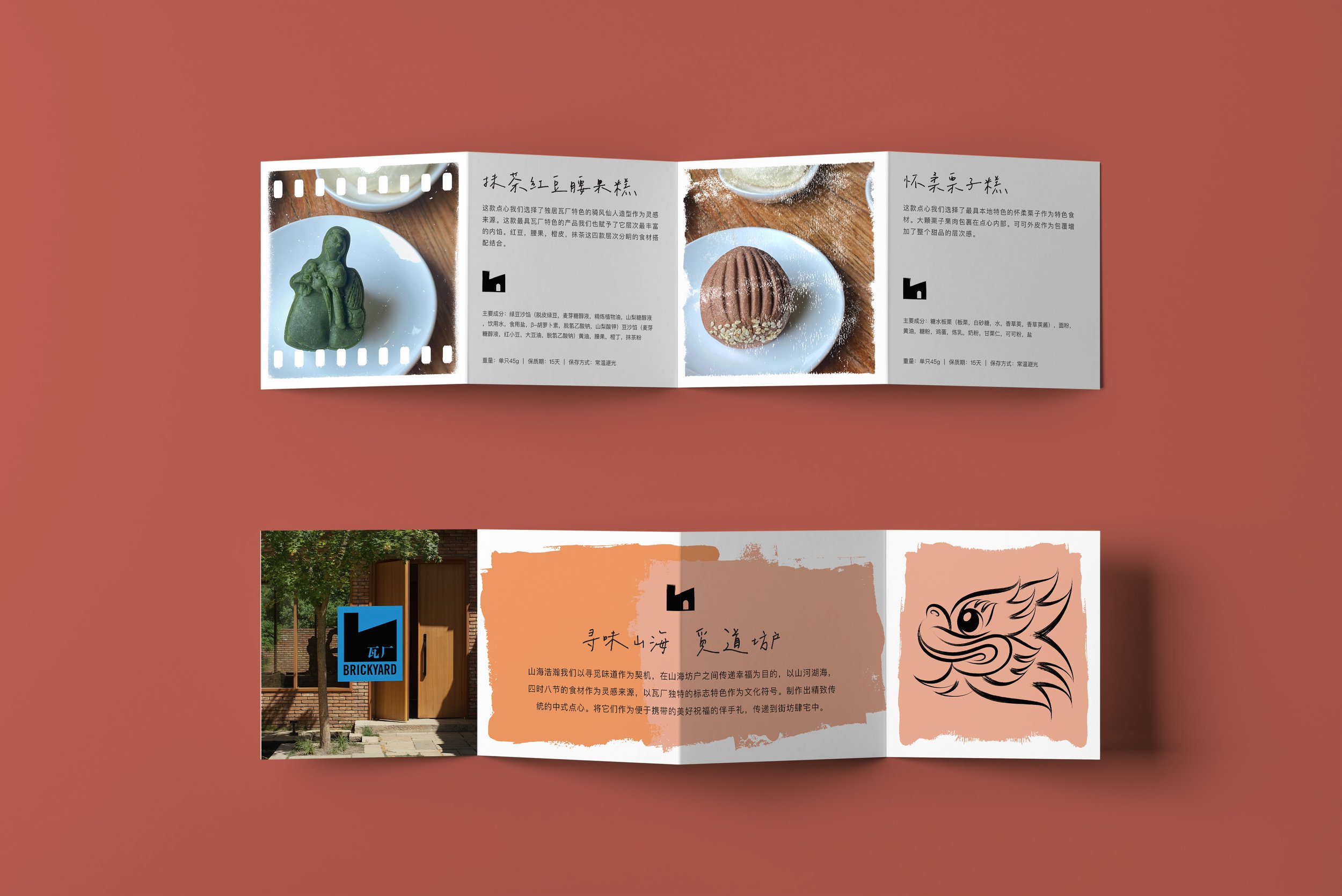
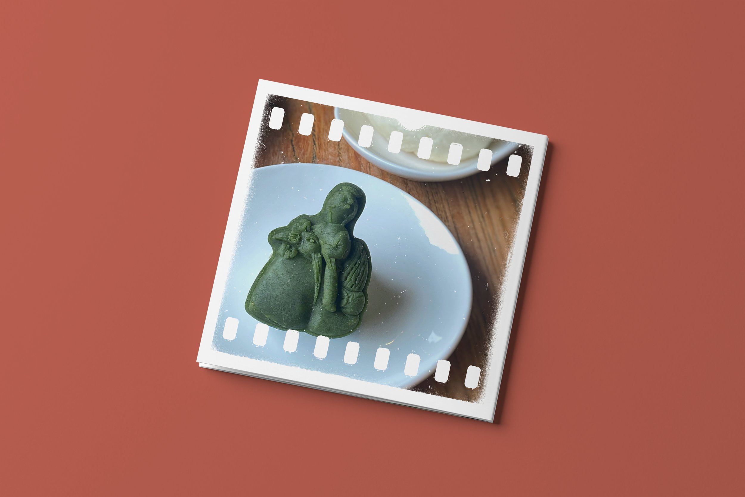
Symbolic Elements: Traditional Chinese elements like "Immortal Riding a Phoenix" and "Beast Head," along with chestnuts, puppies, and children's portraits, capture the essence of the Brickyard Retreat.
Design Style: Printmaking techniques with ink painting inspiration from Han Meilin were employed, blending tradition with modernity.
Implementation:
Collaboration with the Brickyard Retreat Hotel ensured materials, printing, and design integrated seamlessly with the hotel's serene surroundings.
Results:
The redesigned dessert packaging immerses guests in a tranquil, joyful experience, perfectly aligning with the hotel's brand identity.
Conclusion:
This humble approach successfully enhanced the Brickyard Retreat Hotel's brand image, leaving a lasting impression on guests while respecting its natural surroundings.
Chapter 02About the Hotel
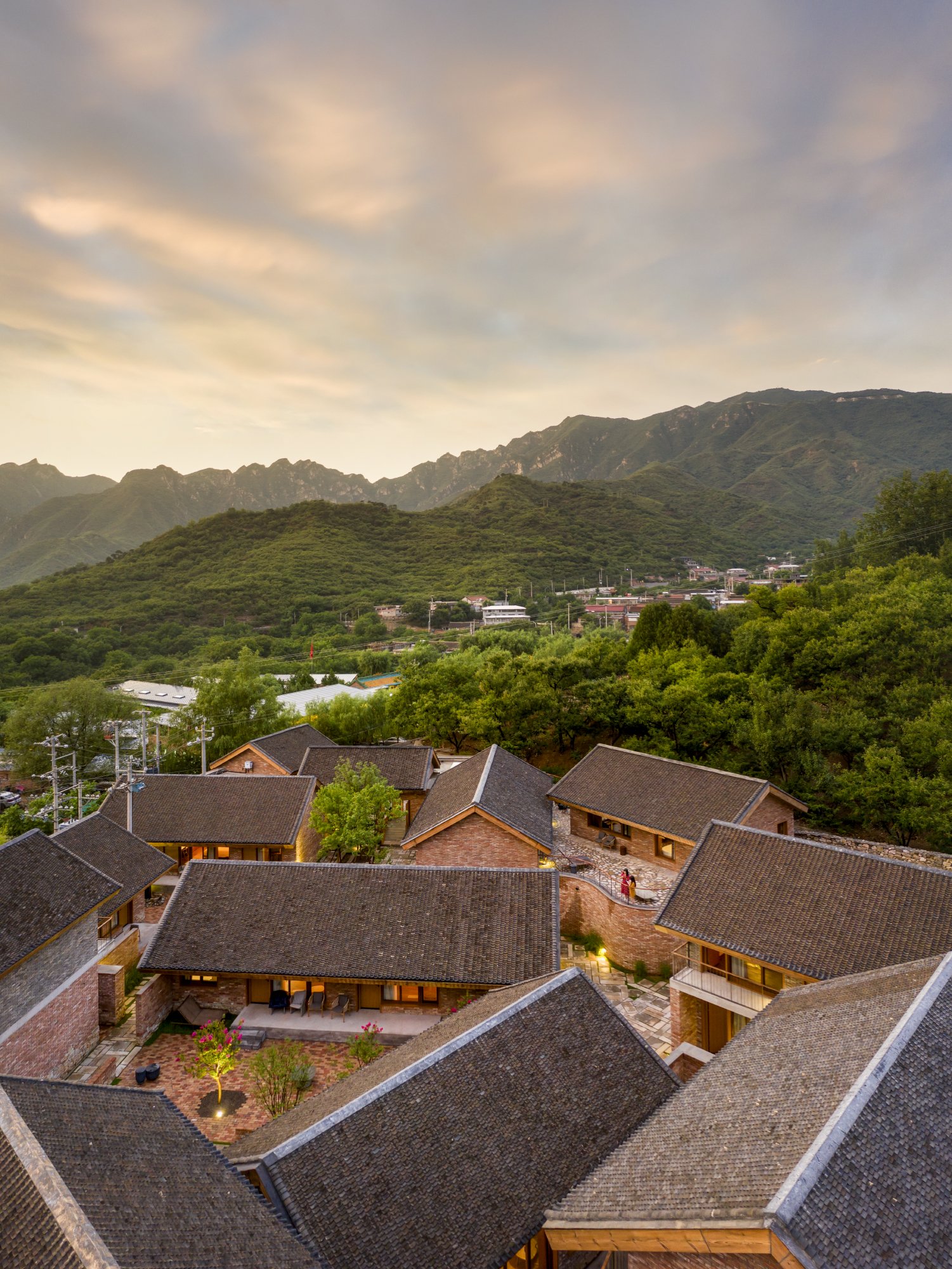
The Brickyard Retreat is nestled at the base of the Mutianyu Great Wall in Beigou Village, Bohai Town, Huairou District. It stands as one of China's most enchanting leisure villages and is a true gem of the beautiful countryside in Beijing. With its stunning mountain backdrop and breathtaking scenery, it has been a welcoming place for many, including both domestic and foreign guests. The presence of 15 foreign families among its residents reflects the harmonious blending of local culture with global influences, creating a village that's brimming with stories from around the world.


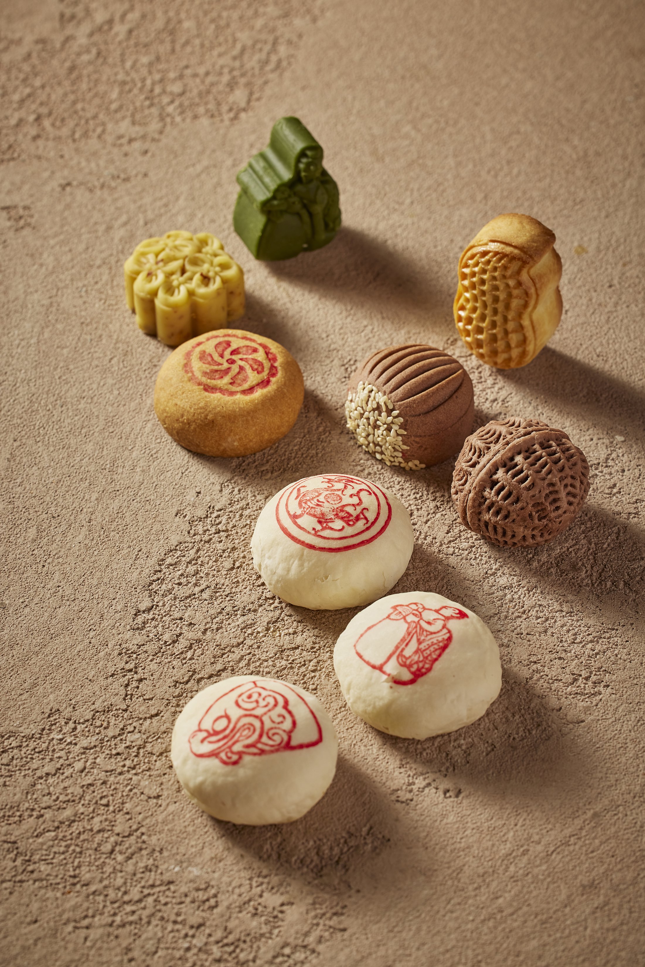
Chapter 03About the Desserts
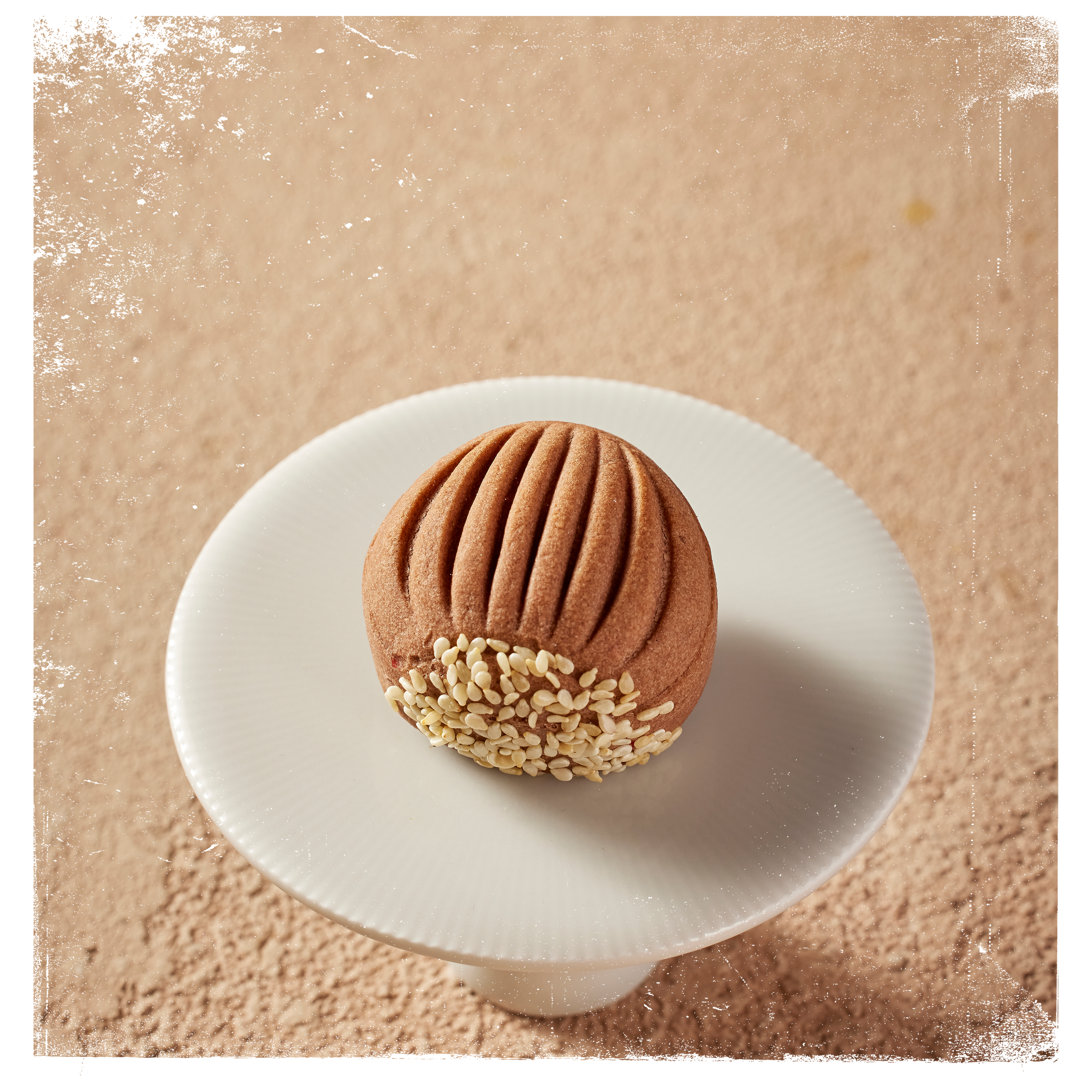
Inspired by nature's beauty, Brickyard Retreat creates traditional Chinese desserts to spread happiness in Mountain and Sea Lane. Crafted from natural ingredients, these delicacies bear our unique signature, cherished gifts to share warmth and well-wishes with neighbors and homes.
Chapter 04Symbolic Design Elements

Portraits of Children
Beast Head
When crafting the design elements, I carefully selected "Immortal Riding a Phoenix," "Beast Head," chestnuts, puppies, and portraits of children to capture the essence of the Brickyard Retreat. "Immortal Riding a Phoenix" and "Beast Head" are integral to traditional Chinese architectural design and are often seen adorning glazed tiles, much like the ones that symbolize the Brickyard Retreat itself. Chestnuts are a symbol of Beigou Village's unique chestnut forests, where these nuts burst from their shells in the autumn breeze, symbolizing the local desire for a happier life. The presence of puppies signifies the harmonious coexistence of humanity and nature, reflecting our commitment to living in harmony with the environment. The portraits of children represent the modern youth's yearning for innocence, simplicity, and a joyful life. Their clear eyes mirror my deep understanding of what it means to lead a content and happy life.


Immortal Riding a Phoenix
Chapter 05About the Color Palette
In my design journey, numerous discussions led us to the choice of an earthy red, oak brown, and warm wheat-like tones that closely resemble Asian skin tones as our core color scheme. These colors symbolize not only our profound connection to the land, countryside, and nature but also embody our collective desire for a happy life as Chinese citizens. The earthy red signifies the land's bounty and the vitality of life, while oak brown represents strength and a solid foundation. The warm wheat color evokes images of natural beauty and underscores our deep connection with the Earth.


Chapter 06