Chapter 01Playful Artistry, Vibrant Whimsy in OliOli's Branding
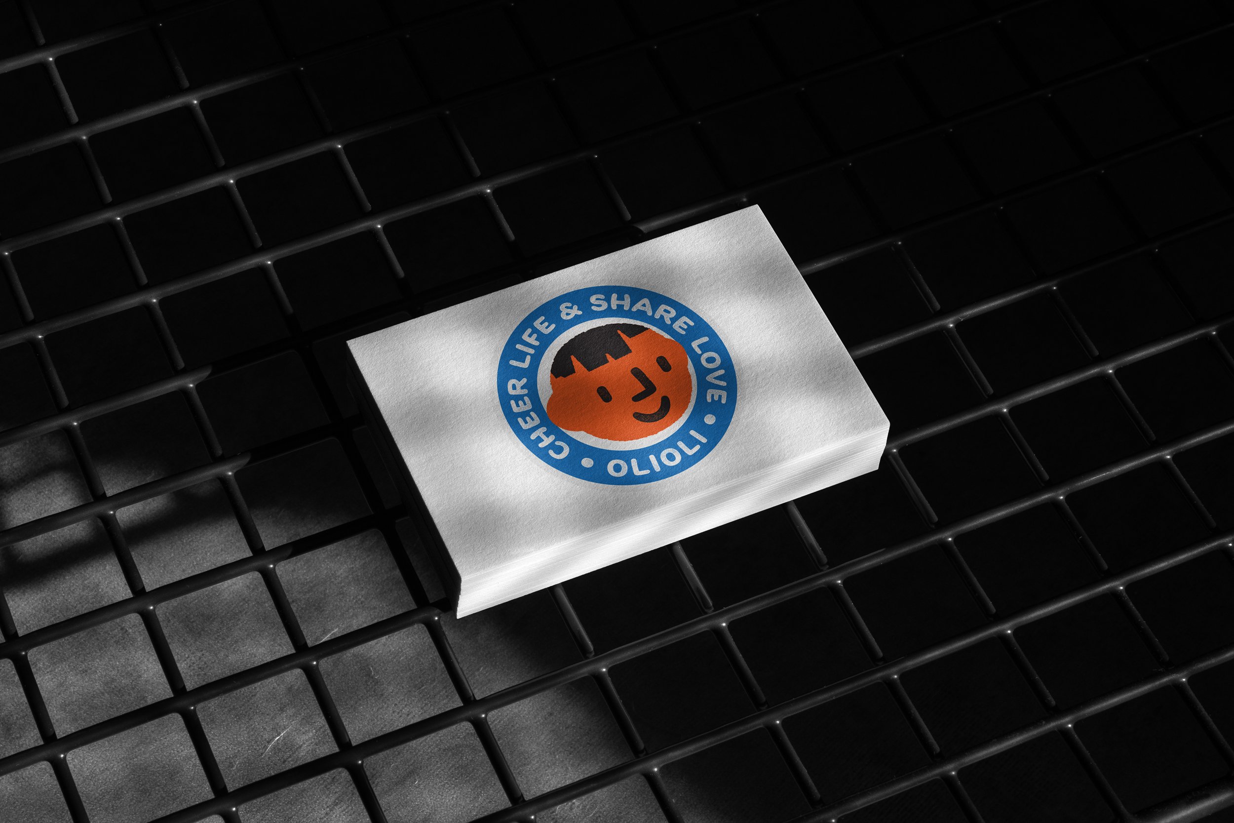
Olioli's playful logo and gift box, born from a Chinese New Year project, blend crafted fonts and vibrant colors to promote cultural learning, fostering joy and parent-child interaction.
Designing a Playful OLIOLI Brand Logo and Gift Box
Last year, my friend Flora asked me to join a project she started – making holiday gift boxes. As a Chinese mom living in the United States, Flora wanted to teach her kids about traditional Chinese culture and encourage them to think about their identity.
Flora had a cool idea: a gift box celebrating the Chinese New Year, filled with small Chinese-style toys like paper lanterns, red envelopes, and ornaments. This gift wasn't just for fun; it was also educational. Flora wanted to promote Chinese culture and inspire creativity in kids. Crafting these toys together would also create a shared experience of traditional Chinese culture for parents and children.
Designing the brand logo had its challenges. Without formal graphic design training, I struggled to understand the details in fonts and to pick one that fit the brand image. Every brand has its unique story, and finding a font that captures attention and fits the brand's personality takes time and effort. I worked hard on the OLIOLI design, even if it's not perfect – I'm always committed to getting better.
For a week, I spent two hours each day looking through fonts, trying to figure out which one best conveyed the brand's tone. I stayed focused on the brand's philosophy to avoid getting lost in the options. I tend to think in different ways, so it was important to keep the brand's core principles in mind.
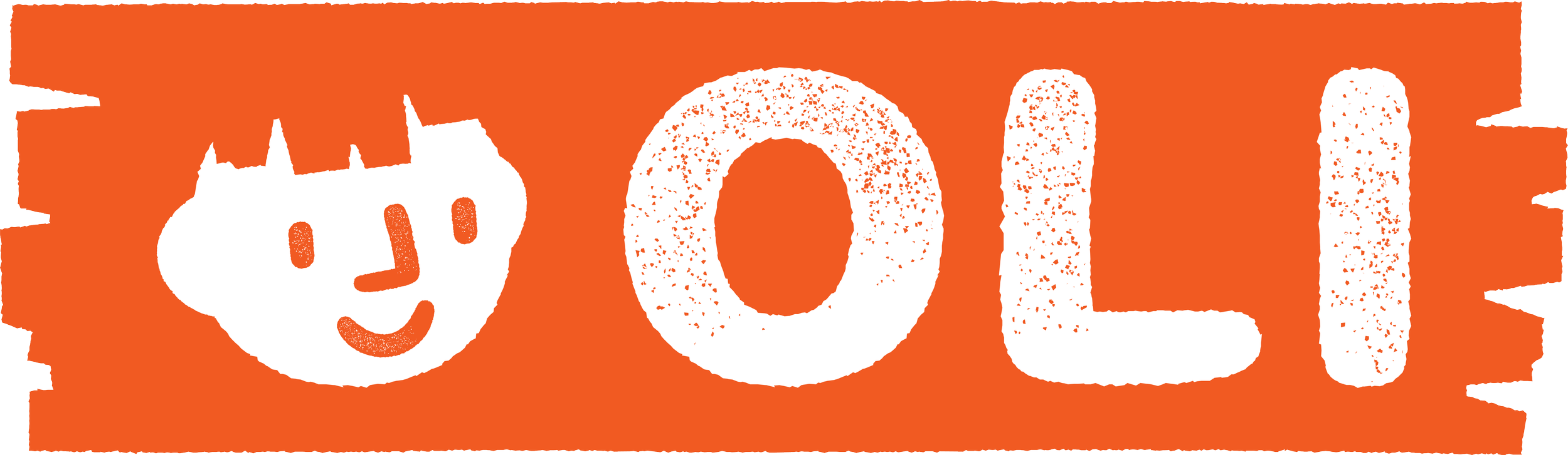
OLIOLI is a brand of toys and cultural gift boxes, so the design needed to be fun and easy. The font had to be simple, readable, and cute for the interaction between parents, teachers, and children. I wanted the font to feel a bit "crafty" and "rough" – like it had been around for a while. This came from my experience in printmaking, where imperfections in the process can be beautiful. It's my way of saying to kids: don't worry too much about the details in art – there's no right or wrong, so just enjoy creating!
Another challenge was balancing the shape of the trademark and the font. Designers often wonder whether to create the font or the trademark first. Since I chose the font first, I looked for elements in the letters "OLI" to create the trademark. These letters already looked like a smiling face, so I built on that to design a logo that works as both an icon and a font. In the end, I successfully finished this design.
Cheer life & share love
Cheer life & share love
The packaging is designed to be both durable and playful, with enchanting illustrations that tell stories and make unboxing a delightful experience for all.


充满童趣的OLOIOLI品牌标识设计及礼盒构思
声明:这是一个无偿自愿者项目,我在业余时间帮助好友Flora进行品牌标识和礼盒设计,旨在支持并宣传中国文化,同时也是锤炼我个人设计技能的一次尝试。
去年,我的好友Flora邀请我参与一个由她发起的节日礼盒项目。身为一位来自中国的华侨妈妈,Flora渴望在美国让自己的小孩深入了解和学习中国传统文化,同时启发他们对身份认同的思考。
Flora的设想是推出一款庆祝中国新年的礼盒,里面装满了各式各样的小中式玩具,如纸灯笼、红包、挂件等。这不仅是一份送给孩子的节日礼物,更是一份具有教育意义的礼物。Flora希望这个礼盒不仅能宣传中国文化,还能激发小朋友的创意,使他们在制作这些小玩具的过程中与家长产生更多亲子互动,共同体验传统中国文化。
在设计品牌标识的过程中,我一直致力于克服自己在字体和商标融合上的困难。首先,由于我并未接受过正规的平面设计培训,对于字体中隐藏的细节差异和如何调整字体等方面的知识了解有限。此外,在众多字体选择中挑选一个符合品牌形象且能脱颖而出的字体也是一项相当具有挑战性的任务。每个品牌都有其独特的故事,而在这千千万万的字体中找到一个既符合品牌个性又能引人注目的字体需要花费大量时间和精力。因此,在OLOIOLI的设计中,我努力克服了这一难题(至于是否成功,交由各位评判,但我将持续努力提升自己)。
接下来的一周,我每天投入两个小时认真筛选字体。在这个过程中,我反复思考一个问题,即什么样的字体能够最好地体现品牌的调性。在浏览字体时,我保持冷静,深入思考品牌的核心理念,以避免迷失自我。(由于我的思维非常跳跃,有时候很容易从一点发散到不同的点,然后发散太远,走入思考误区,忘记品牌的核心理念。)OLOIOLI是一个玩具和文化礼盒品牌,因此设计必须充满趣味和轻松感。在挑选字体时,我始终记得礼盒是为父母、老师和小朋友设计的互动产品,所以字体设计必须简单易读且可爱。
此外,我希望字体能够呈现一些“工艺感”和“工业感”,不必追求完美,反而应该带有一些“粗糙”的痕迹,仿佛经历了时间和岁月的打磨。这个理念源自我学习版画印刷时的体验,我喜欢艺术家工作环境的凌乱和“狼狈”感。我喜欢那种不完美的印刷效果,印刷滚轮在纸面上留下的细碎裂纹和不小心蹭到的颜色,正是我对“工艺感”和“工业感”的理解。这也是我对艺术的理解,创意和美无需追求完美。因此,我希望向小朋友们传达一个信息:在创造艺术时,不必过于拘泥于细节,艺术没有对错,放心去创造吧!
第三个问题是如何平衡商标的形状和字体的形状。是先有商标还是先有字体,是我作为设计师经常面对的另一个问题。字体应该服务于标识,还是标识应该服务于字体?这个问题的答案可能因设计师的设计习惯而异。由于我这次是先选择了字体,所以我决定在字体中提炼标识的设计元素。在确定字体后,我立即开始在"OLI"这三个字母中寻找可以用来制作标识的元素。一看到这三个字母排列在一起,就能立刻发现它们的可塑性极强,基本上已经构成了一个笑脸。因此,我迅速着手扩展我的设计,思考如何在“童趣”、“活泼”、“可爱”这三个关键词中描绘笑脸,并结合字体创造一个既是图标又是字体的标识。最终,我完成了这一设计。