WorldPride DC 2025
Discover OliOli's Special Pride & Joy Gift Box
This June, join us in Washington DC as we celebrate WorldPride 2025. OliOli is excited to participate as a Festival Exhibitor, bringing a specially designed gift box to commemorate this significant event.
Pride Unboxed
Let the spirit of Pride Month inspire you to find your voice, embrace your boldness, and celebrate your creativity.
Our Pride & Joy Gift Box includes carefully selected items: a traditional Chinese folding fan, a stylish bandana, a practical tote bag, playful temporary tattoos, a decorative paper lantern, and thoughtful postcards. Each item features designs that reflect our community’s values of pride, boldness, creativity, and imagination.
Crafting Community Connections
The Pride & Joy Gift Box encapsulates symbols of LGBTQ+ culture, each item thoughtfully chosen to reflect the community's vibrant spirit and history. From the expressive Chinese folding fan to the communicative postcards, this collection is more than festive; it's a toolkit for identity, unity, and celebration during WorldPride and beyond.
Chapter 01Playful Artistry, Vibrant Whimsy in OliOli's Branding
Olioli's playful logo and gift box, born from a Chinese New Year project, blend crafted fonts and vibrant colors to promote cultural learning, fostering joy and parent-child interaction.
Designing a Playful OLIOLI Brand Logo and Gift Box
Last year, my friend Flora asked me to join a project she started – making holiday gift boxes. As a Chinese mom living in the United States, Flora wanted to teach her kids about traditional Chinese culture and encourage them to think about their identity.
Flora had a cool idea: a gift box celebrating the Chinese New Year, filled with small Chinese-style toys like paper lanterns, red envelopes, and ornaments. This gift wasn't just for fun; it was also educational. Flora wanted to promote Chinese culture and inspire creativity in kids. Crafting these toys together would also create a shared experience of traditional Chinese culture for parents and children.
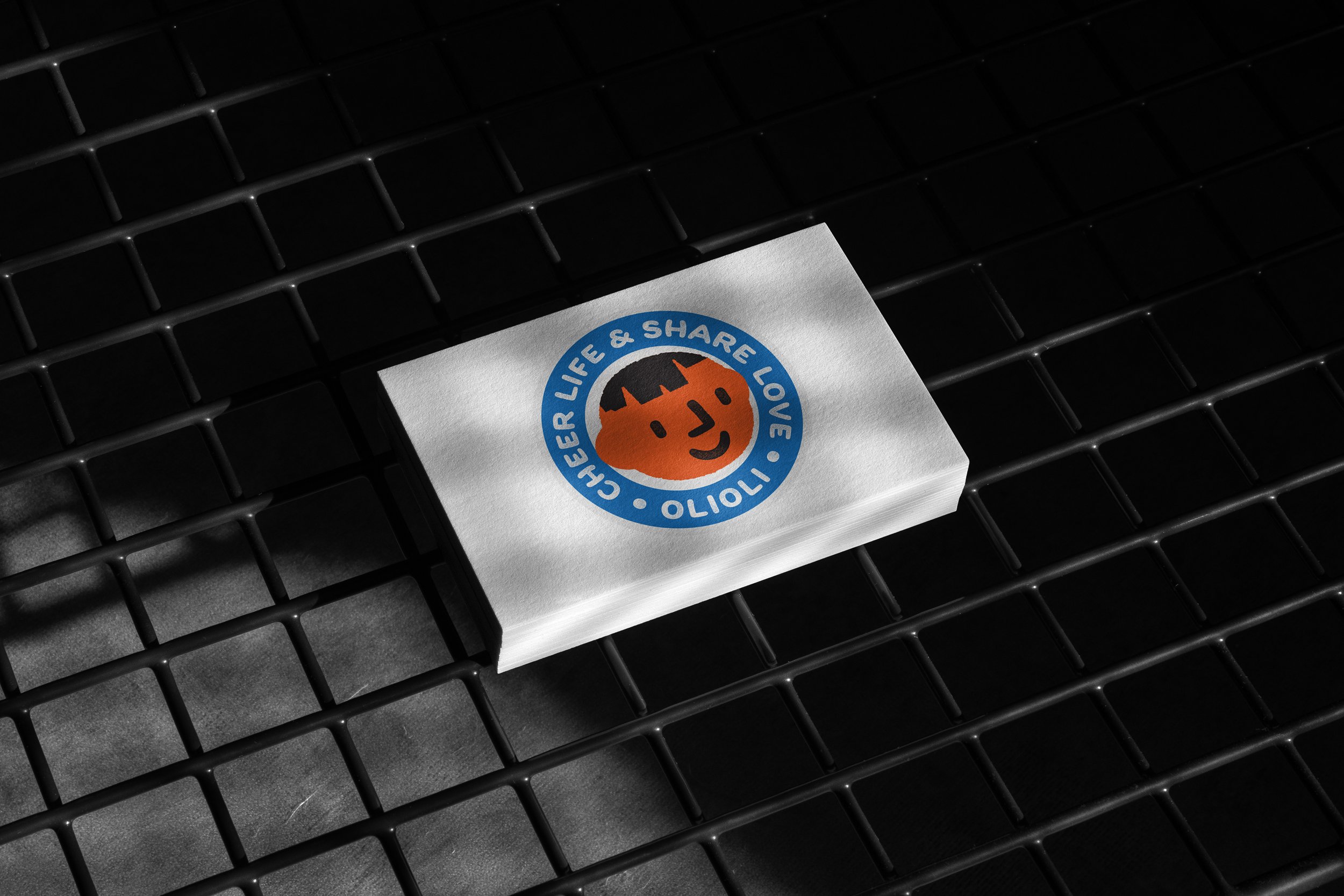
Designing the brand logo had its challenges. Without formal graphic design training, I struggled to understand the details in fonts and to pick one that fit the brand image. Every brand has its unique story, and finding a font that captures attention and fits the brand's personality takes time and effort. I worked hard on the OLIOLI design, even if it's not perfect – I'm always committed to getting better.
For a week, I spent two hours each day looking through fonts, trying to figure out which one best conveyed the brand's tone. I stayed focused on the brand's philosophy to avoid getting lost in the options. I tend to think in different ways, so it was important to keep the brand's core principles in mind.
OLIOLI is a brand of toys and cultural gift boxes, so the design needed to be fun and easy. The font had to be simple, readable, and cute for the interaction between parents, teachers, and children. I wanted the font to feel a bit "crafty" and "rough" – like it had been around for a while. This came from my experience in printmaking, where imperfections in the process can be beautiful. It's my way of saying to kids: don't worry too much about the details in art – there's no right or wrong, so just enjoy creating!
Another challenge was balancing the shape of the trademark and the font. Designers often wonder whether to create the font or the trademark first. Since I chose the font first, I looked for elements in the letters "OLI" to create the trademark. These letters already looked like a smiling face, so I built on that to design a logo that works as both an icon and a font. In the end, I successfully finished this design.


